Val’s Dining Room Buffet – Part 3
Sometimes, making design choices, whether decorating your home with accent pillows or building stunning, massive built-ins for your dining room — is easy as eating ice cream on a hot summer day. Other times, knowing EXACTLY the right thing to do is … clear as MUD. Today, Val is having a touch of trouble deciding what she likes, loves, or simply can live with. So I suggested we let you all weigh in and see what you think.
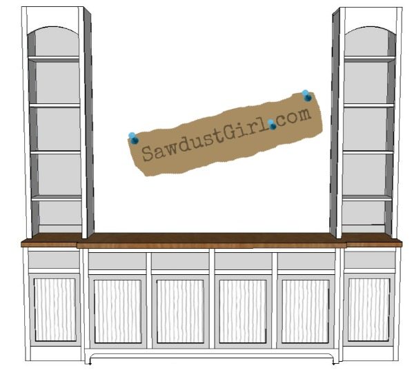
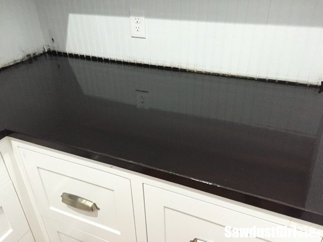
Do you remember Val’s dining room project? She is moving right along. Lower cabinets are done. Countertop is installed, outside upper cabinets are installed but the middle section is where the project comes to a halt until a decision can be made.
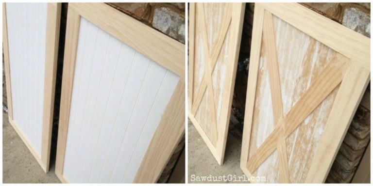
Or do you like the idea of hanging a big sign right in the middle? I’ve got an idea for that!
Anyway…
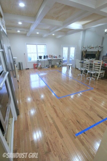
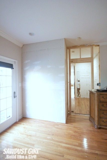
My original sketch had three separate cabinets in the middle section. Well, as is prone to happen in the middle of a project , this design had to change — because of the unfortunate placement of a very large intake vent on the wall. (More on the awesome way we solved that problem later…)
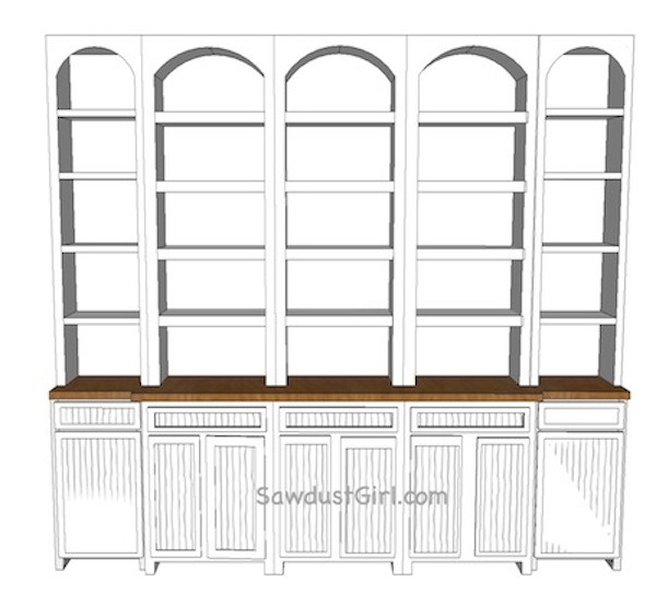
Instead of three cabinets, the middle base was built in two sections. The problem is that with two large sections on the top, the shelves will sag. It’s too wide a span to just have two sections and be done with it. That WOULD be too easy. We have to get creative. Val and I have come up with four possible choices.
Option 1: Six small sections
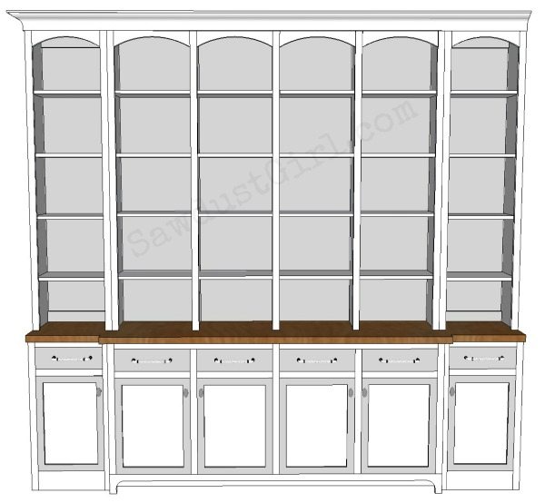
Option 2: Two sections with columns. (The shelves are too wide to not sag without the columns…herein is the problem.) 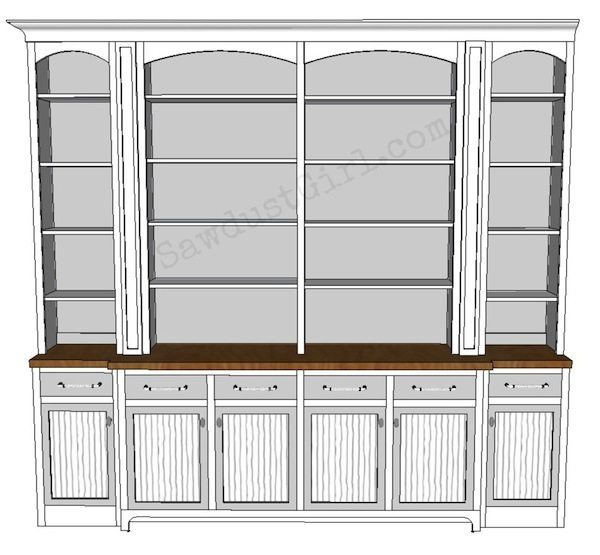
Option 3: Two wide sections with wine storage.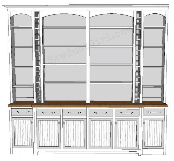
Option 4: Two wide sections flanking a narrow section that mirrors the end cases.
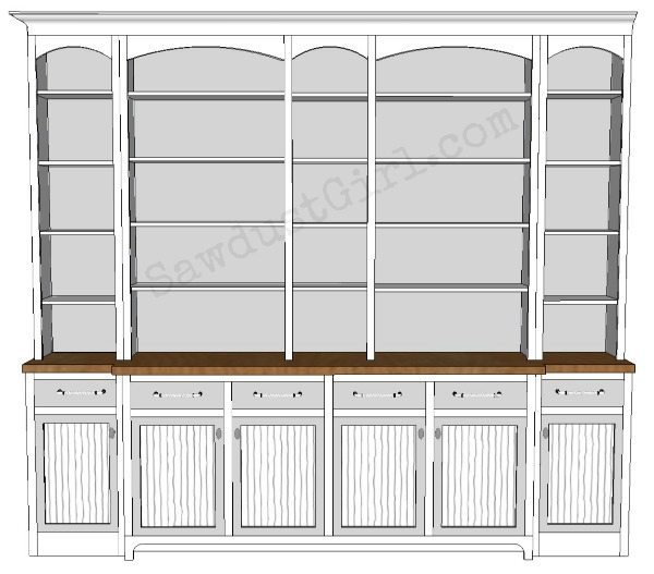
I’m not saying a word about which one I would choose.
Sometimes, when you’ve been working on something for weeks and weeks, everything starts to blur and you need a second opinion.
‘Cause it gets hard to find your way when your vision is blurry and all you see is arrows pointing in EVERY direction.
So, which one would YOU choose?
See what she went with in part 4!


I really like option #2. It seems less busy. I like clean and simple styles.
Option #3! I think there are a lot of horizontal lines in the design, and having the wine storage columns provides nice vertical balance and is most pleasing to the eye. Also, the wine storage idea is unique and really elevates this design beyond simple cabinets and shelves. It will surely be the most talked-about, buzzworthy feature when it’s finished!
I would want #2…..looks awesome!
I like option #2 the best and it also looks like the easiest to build, double score! Maybe if she needs wine storage she could build something into one of the lower cabinets?
I like 2 & 4! Simplicity.