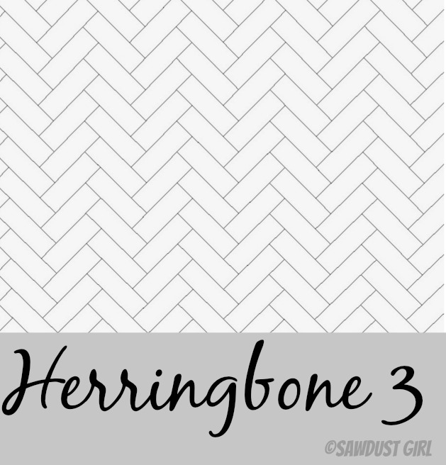
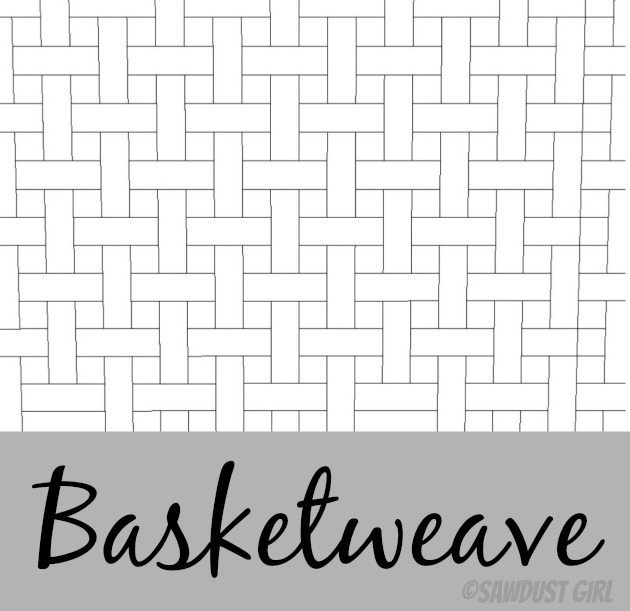
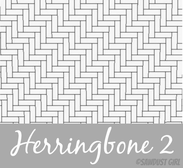
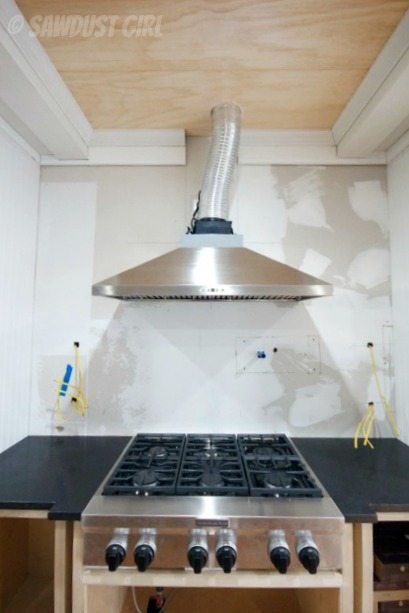
I’m going with a classic, white, subway tile for my kitchen backsplash but I’m going to install it in a cool pattern, instead of simple staggered horizontal lines. It’s a large area, about 7′ x 5 1/2′ and I’m tiling the whole thing. I love the openness here so I’m not putting upper cabinets in but I will add a couple floating shelves. The electrical cable sticking out of the wall is for under shelf lighting –in case you were wondering. 😉
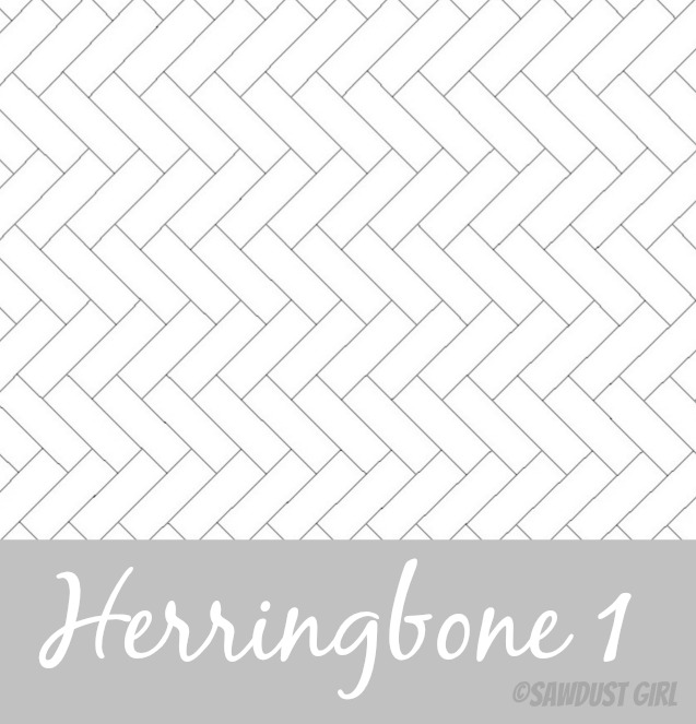
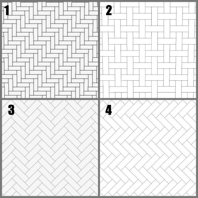
I’ve sketched out four different pattern and thought it would be fun to let you all weigh in on the decision.
Here’s a larger picture of each design option to look at before you make up your mind.
Won’t this be fun?
Yes — Of course it will!
Tell me which option you like best and then let’s see what happens!
Victoria Dorotiak says
I’m not a fan of white subway tiles, I think it will be a short fad and that many people will be unsatisfied with them sooner than other materials. That all said If I had to have them in my kitchen, I would choose Herringbone 1 or 2
Lori says
Seriously? White subway tiles are classic. They certainly aren’t a new fad; they’ve been in style for a century.
Meche says
I like the basketweave
Laurie M. says
I second the basket weave 🙂
Mary Lee says
I third the basketweave! Something about it just feels balanced to me since all the others draw my eye in a particular direction.
Corbin says
I love the basket weave pattern. It is a classic look that will never go out of style. It also looks like it will take the most work. Probably why it also has a very expensive look to it 🙂
Linda says
I like the basket weave best, although I realize that could be more work if the matching square tiles aren’t available and you need to cut tiles. My second choice would be herringbone 3.
Leslie says
I’m another fan of the basketweave!
Joan says
Basketweave
Cara says
White subway tile is about as timeless as you can get. They date back to the early 1900’s. If its a fad then its a really long one! 😉 That being said I love herringbone 3 the most but basketweave is a very close second.
Teresa V says
Herringbone 3, but all the patterns are lovely.
Cammie H says
Love the basketweave!
Juli B says
Basketweave!.. beautiful!
kelly barry says
BASKETWEAVE hands down!
Lori says
#3 is definitely my favorite!
Cat Hoehn says
Basket weave – not as busy-
dora says
Herringbone # 3
Kristina says
You have such a great eye – that whatever you choose will, I am sure, look fantastic. I personally love the Herringbone 1, and that would be my choice! Good Luck deciding.
Beth Stephenson says
1. Basket weave
2. Herringbone 3
Janet says
Basket weave is definitely my favorite!!! It’s not as frenetic looking.
Janet says
I would like to amend my comment to say that I love the traditional brick pattern, but with a tile frame under the range hood, the basket weave would be a beautiful focal point and you wouldn’t get so much eye movement. Some of the herringbone patterns make me dizzy!
Laurie says
Basket weave or herringbone 3 are my faves. 🙂
Korrie@RedHenHome says
Basket weave is my top choice, but herringbone is a close second!
Diane Y says
Herringbone 3!
I think basket weave looks too busy and all those little cuts would drive me insane! 🙂
Lynda says
Herringbone or herringbone 1 in that order. Any choice will be beautiful!
Lee-ann says
Basket weave because in 10 years it will feel more classic than old-fad of 2013-14.
Andrea says
Herringbone 3. The vertical Herringbone would drive me nuts – I would constantly want to “straighten” it (put it horizontal), which is silly, because the one on an angle doesn’t bother my brain near as much. Whatever you choose, I know it will be spectacular.
Lisa E says
Basketweave because so many are doing herringbone, although I do love herringbone three as well.
Mary R says
Herringbone 3 is my personal style but any of them will be beautiful.
dani says
I choose basket-weave. It has a lot of interest and is unique.
Heidi H says
I love the basketweave. I also feel like it is really balanced and is a little more timeless than the herringbone. I also think that with the amount if wall you are covering it will be beautiful. Good Luck. I love following this remodel and hope your feeling better everyday.
Jen says
Herringbone 1. Although I think it is funny that you numbered them differently in the two different pics. The Large Herringbone 1.
Kelly says
Love the Basketweave. The others are boring or busy looking.
Sarah says
I am a sucker for the simple horizontal, staggered lines. But, if that does not appeal to you, I like 3 second best. Your kitchen is looking so great!
Lena says
I like the basket weave, but I like order so herringbone is never one I like.
Cynthia@OrnamentalStyle says
My two cents. I like the basketweave the best because herringbone 2 looks too busy and herringbone 1 and 3, while lovely, might be too trendy. I haven’t noticed anyone doing basketweave so while it’s classic, you’d be ahead of a resurgence. Thanks for asking!
GretchenB says
Definitely the basket weave because it provides texture, but in a controlled way. A symbol of our naturally chaotic world, with a little illusion of order thrown in. BTW, I love your granite.
Amy says
Herringbone 3
Liz VanKirk says
Herringbone 3. It looks great esp from across the room. Can’t wait to see. Are you using a white grout or a light gray?
CarolAnn H says
Basketweave
LizSholl says
Herringbone 3 for sure.
Joe says
basketweave for sure
kim massa says
basket weave … it says “I am calming yet interesting, I am classic without being boring. You will never tire of me .” That is what it told me anyway. What do you hear it say?
Beth says
Number 3 is speaking to me!
Deb C says
#2- Basketweave
Christen Geron says
Herringbone #3, the vertical one!
dc says
I’m going against the tide and saying #4.
Kelly says
#2 Basketweave.
Betty Robey says
Really LOVE the basketweave design !!!
Dani Barr says
I’m really liking #3 as well.
Ann C says
#2 basket weave seems not as busy to me, and with that big of a wall busy could become overwhelming. Will be anxious to see the finished product, whichever one you choose.
Laurie Curtis says
#3 hands down
jb @BuildingMoxie says
sorry the basketweave kinda hurts my head… in this space I’m thinking Herringbone 3 … number three… but putting an accent strip high wouldn’t give it the feeling of more height. digging the counters btw. cheers.
jb @BuildingMoxie says
sorry “but Wonder If putting …”
Pattie C says
Herringbone 3 is beautiful. I love the basket weave but it looks so hard to do.
DAC says
I like the #2 – basket weave but it would be a pain to install. To much cutting & trimming.
Bonnie says
I like #3 Herringbone. Looks like there would be less cutting with the herringbone than the basketweave. Good luck with whatever you choose! I’m sure it will be beautiful!
Kim says
I like the herringbone 3 pattern as well. Since it’s vertical, it will make the wall look taller, theoretically. I too like the basket weave, but it doesn’t have as much movement as the herringbone 3, so it’s my second choice. Plus it has a ton of cuts! 🙂 Maybe purple grout? (j/k)
FlowerLady Lorraine says
Basket weave is my favorite.
tracey says
They’re all so lovely. The basket weave seems more interesting with less pieces to cut, but the movement in each herringbone is so interesting!
Can’t wait to see it done – whichever one it is.
Lisa says
Herringbone #3!
Mary Ruth says
I like the basketweave, not predictable, and for many years to come will show off the work you did… by not taking the easy way out. Why not give yourself what YOU can do, what you are capable of? 🙂
Nicole Lyon says
Hands down 1 or 3!
Lori says
Another vote for Herringbone 3!
Kim F says
I love the basket weave! I would like to see how you do it.
Jessica says
Herringbone 3! LOVE!
Faye says
I too prefer the basket weave pattern. The 3 herring bones have movement, carrying the eye diagonally or up and down.
Love seeing all of your projects!
Annette Oldenburg says
Love #3
Cheryl says
I love the Herringbone 3 the best!!! I also like Herringbone 2 but feel it might be too busy of a pattern. I feel the stove and the exhaust are the main attraction here and that the tile should compliment it, not take away from it. I’m sure no matter what pattern you pick it will all look beautiful. Good luck!!!
vediegis says
basketweave or herrigbone 3.
Ayisha says
I’m loving the first Herringbone option. The basketweave reminds me too much of the 60’s bathroom floor tiles.
Jerri C. TN says
Herringbone # 3 – Love, Love, Love it!
Maureen says
basketweave is timeless
Rachel says
I really love Herringbone # 3.
jan says
I would say the basketweave but it looks like there would be a lot of cutting so I would pick the herringbone #3. Reminds me of a chevron pattern that’s so popular now.
Rebecca says
#3 please! Classy.
Tiffany Nash says
I like Herringbone #3, too.
Debbie says
basketweave!
Mary says
Basketweave!
Lisa P. says
Another vote for basketweave…
Cat says
Herringbone 1 or 3! To determine which, between the two, you need to decide whether you want to lengthen the space (Herringbone 1) or widen it (Herringbone 3). Both are lovely.
Carmen Leong says
Basketweave.
the retired mama says
Basketweave
Gail Moretz says
Herringbone 1 or 3. Think I am leaning toward 3.
coffeewitholiver says
Basketweave. Classic and timeless.
Naomi J says
I guess I’m the only one who likes Herringbone #2 (or square #1. It’s kind of wigging me out they aren’t in the same order! I’ll get over it I’m sure). I think herringbone is a great pattern that is visually interesting, and I think the way it is oriented in #2 gives it a little extra spunk while keeping to a classic pattern. Great ideas all of them though!
Linda Southworth says
I think Herringbone #2 has depth drawing your eye upward on a diagonal. Looks sharp!
Sharon G says
Love the Basketweave!
kristin says
I would say herringbone #3–nice and traditional–you won’t look back and regret it. I like the basket weave but it looks like alot of work and something is telling me 80’s and blue and mauve, and baskets. Sometimes simplicity is better, and since you are already switching up the traditional horizontal subway, herringbone #3 is just different enough. H #2 is just plain BUGGY on the eyes!
Melanie says
My vote is Herringbone 3. Have fun!
Ava says
I like the Basketweave pattern
Khaki says
I personally love the basket weave pattern!
2nd choice would be Herringbone #3.
Sarah says
I like both Herringbone #3 and the basket weave. If it were me, I think I would go with the basket weave because I think herringbone might be trendy enough to make the kitchen look dated once it is out of style.
Roberta says
Herringbone 3, different enough without being trendy
Holly T says
I love the basketweave! My second choice would be Herringbone 3, very classy!
Jeri says
3
Sarah says
I really like the basket weave as well. My 2nd favorite is number 3.
Guerrina says
First choice is the Basketweave follow by Herringbone3.
cindy says
i love the herringbone #2 and the basketweave second….
Lisa Weinstock says
I just completed the herringbone #3 in my own kitchen. Looks great! Love it!
Patty says
Definitely love the basket weave.
Theda says
Herringbone #3 is my favorite
Kerri says
Herringbone3
Anna [Directions Not Included] says
Basketweave or herringbone #3 are tied for me. Love them both.
Jeanne Gillett says
Basket weave!
Maria says
Basketweave is my favorite
Susie Heller says
Basket weave is timeless and high fashion, yet simplistic. (Can’t think of the word I want meaning high fashion). hum…..
Dee Miles says
I like Herringbone 3 the most! Basketweave 2nd.
Jenn A says
basketweave!
Audrey says
Herringbone 3 or basketweave
Saneth says
Basketweave and Herringbone 3
Diana W. says
Basketweave. I think the herringbone is going to be ‘chevron’ outdated in a couple of years.
LoretteC says
Herringbone no 3… it “reflects” the shape of the fan…
Denise says
Basketweave with out a doubt. It will still allow the flow of the horizontal floating shelves to the eye.
Jenny says
the basketweave.
Terry Brown says
Basket weave
Kay says
Herringbone 3
jenny says
I am living vicariously through your gorgeous kitchen and your insane ablility! I love herringbone 3. the pattern leads the eye upward, toward that gorgeous ceiling!
Diann says
I also really like Herringbone 3. I think it is oriented well for the space, up/down to accent the height and draw your eyes up to the hood. I like the basket weave, too, but the herringbone has a little extra edge (to me).
Carl Liebno says
I like the basket weave but it looks like a lot of work. So I would go with the Herringbone 2
Mel says
I like the basket weave, it just looks richer to me!
Samantha says
Herringbone 1 is my favorite with Herringbone 3 being the close second.
I am LOVING watching you walk us through your kitchen renovation. 🙂
Colleen N says
I prefer the 2 patterns that run vertically (Basketweave and Herringbone 3), as opposed to diagonally. Of the two vertical options, I prefer the Basketweave, but it looks like a real bear to do. It also seems more textural, less flat. looking forward to seeing what you do. I imagine it will be easier to do the wall tiling than floor tiling, which I found really hard on the back.
Colleen N says
Or you could go for broke and do basketweave on the diagonal. =)
Colleen N says
Though looking a pictures on-line, the diagonal nature of the herringbone patterns seems to depend largely on how much contrast there is between the grout color and tile color. Ones that have a grout color similar to the tile color seem to draw the eye a lot less, i.e. the diagonal nature of the pattern is a lot less apparent; it becomes more of a textural element. Interested in hearing what you decide.
joyce says
Basketweave would be amazing!!!
Victoria says
Basketweave for me!
Amanda Comeau says
Herringbone 3
Larry Johnson says
Agreed on the Herringbone #3. I’m a sucker for anything that reminds me of tweed and Mid-Century Modern styles.
Kathleen says
I love the basketweave the best.
stargzrblog says
#3 would be my suggestion of the choices provided, but I honestly think that a traditional horizontal layout would look best here, providing a sort of crisp/classic feel that would go well with the black surfaces and stainless steel appliances. I think that a herringbone pattern has the potential for being too busy, and runs the risk of generating a sort of “country” feel that is inconsistent with that beautiful modern-looking black countertop. If you were worried about a horizontal layout of subway tile looking too “plain” (I personally don’t think it would), you could consider incorporating a darker (smokey grey?) colored tile here and there, or even some sparsely-incorporated glass tile randomly inserted here and there would look great.
terrillr says
I love the Basketweave. But, I’m not crazy about Herringbone most of the time.
Michael says
I like the Herringbone 3 the best, and I like the Basketweave. I like all the Herringbone patterns but in this case I like the Herringbone 3 because I think the vertical pattern will draw the eyes up and add to the openness of the space. The Basketweave will add to a modern feel though, and in white will look great.
Jake's a Girl says
#2 or #3
Susan C says
Basket weave, without a doubt!
Kate says
Such beautiful options, but I’m a member of Team Basketweave. My favorite by far.
Heat says
Herringbone 3 favorite. Basket weave is definitely a country feel.
Rae Ann says
Herringbone 3 hands down! 1 and 2 look sideways to me and the basket weave looks busy. Have fun!
Amy says
I like Herringbone 2. How would you do the basket weave – by cutting tiles to put in the small square areas? Interesting and unique pattern to be sure!
Lindsay says
Love Herringbone 3!
Lisa says
Herringbone 3 has a clean classic look. I can’t wait to see the finished product.
kriver77 says
Hi, I am just a guy and I know nothing about decorating stuff. I am also in the process of a total all the way to the walls kitchen remodel that has turned into a whole house inside and out remodel project. This is being done by myself parts ad labor. No wife, girl friend, sister or other females involved for design and color decisions not a single luxury. I have to do all of it. The only thing I ‘ll have outside help with is the granite counter and the dry wall for the ceiling I couldn’t do it by myself everything else is me, myself, and I. If I was married or had a girlfriend they could say build this or paint it that color and I would be able to just build it and forget it. My question is this: With all the computer programs and stuff, wouldn’t it be more effective to take the picture of the intended tile area and insert the diferent backsplashes in various colors and then choose the pattern you like or in this case what the popular opion would be? I don’t really like any of them they make me dizzy looking at them and give me a headace to boot. Are they suppose to do that? Some kind of subliminal way of female torture for the unsupecting husband or male that cooks?Maybe to make the husband / male stay out of the kitchen and out from under foot? I am JUST KIDDING! I have never been married so I really don’t know. I have never had a live in girlfriend either, code of honor thing. I’ll be 65yrs soon. Being a bachalor and a hetrosexual male trying to do interior design is a major challenge. Choosing paint color is a good example the kitchen goes right to the dinnig room same wall,and that goes to the livgrm and that conects to the hall what goes with what ect. too much work and effort is going into all of this not to have it come out right I want it to look like something out of a architecual or design mag when I am through, not just ok I want it to scream that a masculine male lives here. I redid the baths granite tile counters lamiante floors (saw in a mag and liked it so I sorta reproduced it) vessel sinks just did finished them 2 days before and then….. I had a MAJOR FLOOD. It ruined the floor insurance had the recovery people and plumber and they put giant holes in the walls and tore up the floor ect. Now, I will have to start over again, with the walls and floor, as long as I wiped up any water right away the laminate worked great. Until it went under water, then,that didn’t work so well. Lamitate wouldn’t work for a family situation. I am not sure about putting in laminate floor in the kitchen and just continuing through out the whole house. or lamitate in the kitchen and rest carpet but with that idea the end part for the lamiante is short by a few inches and would show a noticable short part I have been at this for about 3yrsI was told lowes cream in my coffee with darkest I could find laminate and cabinets then use choc leather couches ect what do you guys think? is that a good idea? or not? I have no clue as to what I am doing as far as the interior design stuff goes. The building part I am ok with. It is the female end of this stuff that has got me stuck any ideas? Good luck with your kitchen project. I know the frustration your talking about when your hurt and can’t work. I had the shingles last year at this time and have just now recovered enough to work again. I can’t afford to hire someone to do it for me. There isn’t any satisfaction in that either. bye River
Sheri C says
Basket weave all the way!
Lori says
Herringbone 1. It has just a touch of a horizontal pattern….and we all know horizontal patterns makes things look wider.